

Korea’s Best Aloe Product Sales Company
—
About Client
Univera is the rebranded name of Namyang Aloe – South Korea’s top aloe-related product seller, to expand its effect overseas.
It has been proceeding with a research of aloe science and selling products to customers for 43 years.
—
Needs
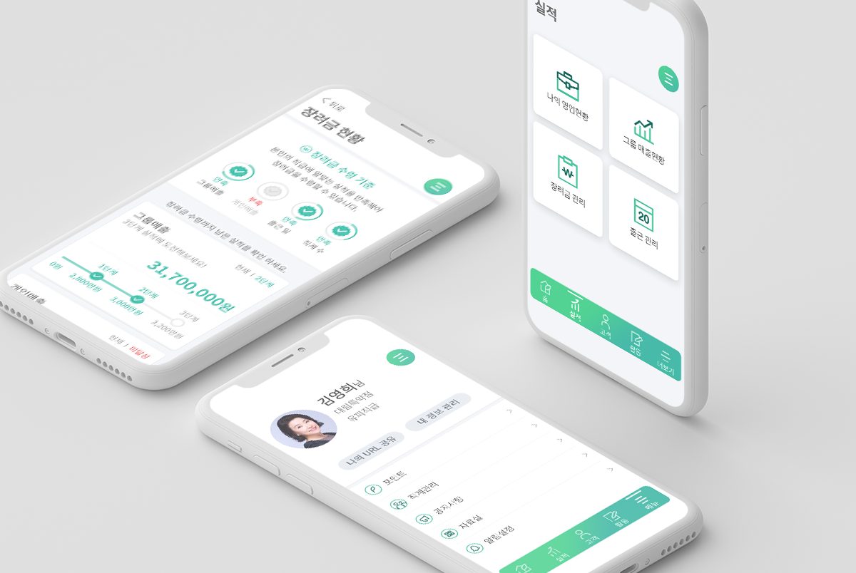
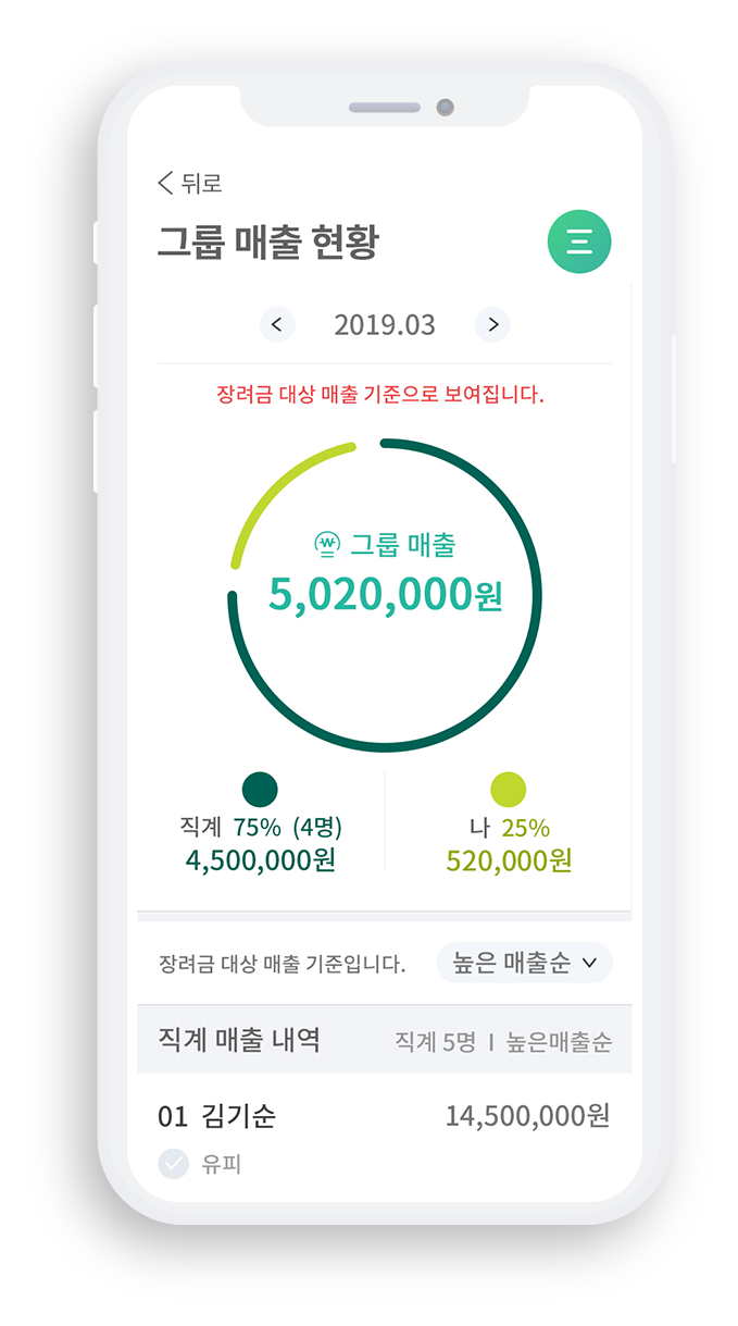
UP is a dedicated counseling organization run by Unibera, and there was a need to quickly and conveniently carry out on-site sales activities. In the meantime, UP needed a sales support system through the Mobile App because they were writing all sales activities manually, such as ordering, unclaimed management, customer registration, etc. We needed to design a mobile application that provides an easy and comfortable user experience for seniors over 60, accounting for most of them.
—
Project Goal
We wanted to increase the convenience of on-site business activities by digitalizing customer information and payment details managed by paper documents.
—
UX/UI Principle
Because the main users are elderly, we focused on the design for the users who are unfamiliar to use the mobile applications.
To analyze the users’ environment, situation, and needs, we have conducted UX consulting in the beginning of the project, and then reflected the derived insights on the UI design. In addition, the core tasks such as customer membership and payment features were provided by simplifying layouts and clearing interactions to users who are not familiar with the digital environment.

—
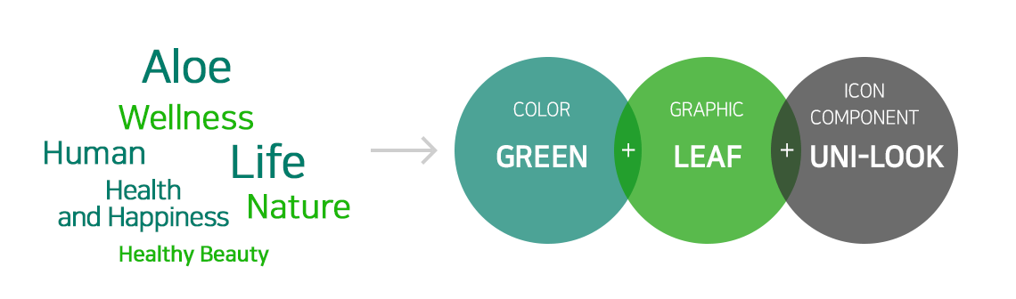
Design Concept 01
3 key elements of GREEN, LEAF and UNI-LOOK were derived from Univera’s identities.

—
Design Concept 02
The service identity is clearly defined using Tone on Tone Gradation on buttons and key backgrounds to express the colorful colors of nature.
The title uses large, bold headline fonts to reflect the latest trends and increase readability.
Color & Identity

– Set the primary color as ‘GREEN’ that reflects the brand identity
– Applied tone-on-tone gradation that feels natural and comfortable
Style & Usability

 Used big, bold titles that reflect the latest trends
 Increased content readability by using more space in the card area
