

The No.1 Trand-setting K-beauty Make-up Brand For Teenagers And Twenties
—
About Client
Etude House is a no.1 trand-setting K-beauty make-up brand with diverse color spectrum, reliable quality, lovely design, and reasonable price that satisfies various tastes to customers in South Korea, as well as in the global market.
—
Needs
Prior to this refurbishment project, the application of Etude House consisted mainly of mobile shopping and lacked the membership that features available online and offline. In addition, service was mainly provided from the perspective of the brand(Etude House), rather than from users. What’s more, the service area was too comprehensive and too broad to help users recognize what this brand’s application features. To address these challenges, it was necessary to discover membership service considered contexts and needs of users – how they think about before, and after visiting Etude House’s offline stores. It was redefined to be in charge of a significant tool to attract customers to visit brand’s offline stores.
—
Project Goal
The refurbishment goal was making an app as a significant tool to attract customer to visit brand’s offline stores.
—
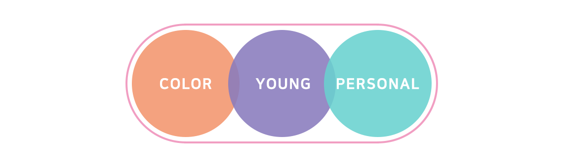
UX/UI Principle
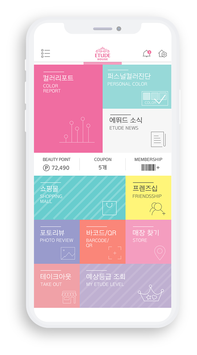
OredX designed to apply the colorful imagery where Etude House has strength at.
– ‘Color Report’ provides preference samples of same age consumers to help users select trendy color.
– ‘Personal Color Diagnosis’ menu that recommends appropriate color patterns suit users.
In addition, based on the statistical fact that target age group purchases cosmetic products through relationship with their acquaintances,
we designed ‘Friendship’, which provides discounts when a customer has specified a certain product and purchased together with their friend(s).
And the app provide both benefits Etude House’s customer level and Amore pacific’s total point service ‘Beauty Point’, so that the user can receive two benefits with one product purchase.
Differentiated Services


—
Design Concept
As the target age group was reset for early 20s, existing concept called ‘For Princesses’ was also re-established in the direction of ‘Colorful’.
Various colors are used, but visual fatigue is reduced by using tone in tone colors and placed in each element.